Zello
Modernizing a popular voice messaging app ∙ 2018
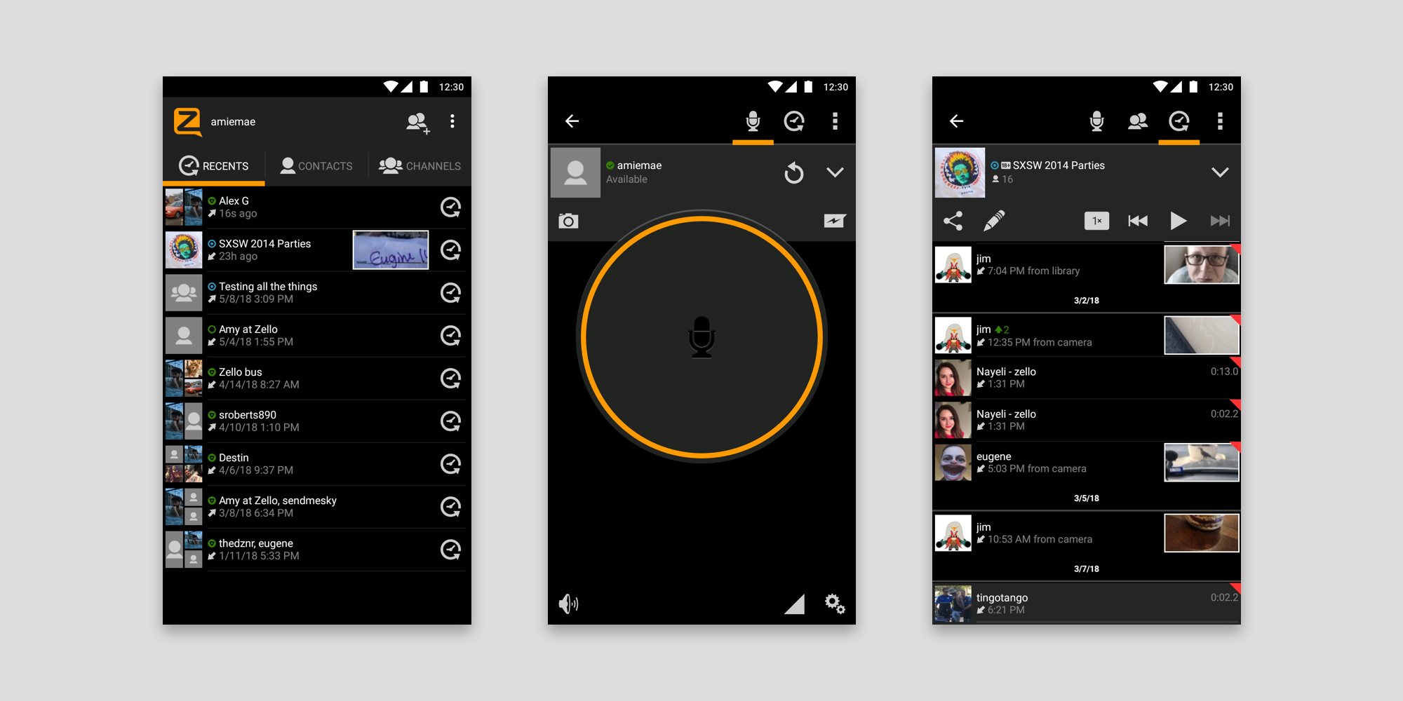
When I began working for Zello in 2018, the Android application had not been updated in several years. The previous design looked dated, lacked standardized patterns, and had accessibility issues.
As product design lead at Zello, I updated the Android app to a more modern appearance, adhering to Material Design guidelines and improving accessibility. In doing this, I relied on native patterns while building out a working style guide to maintain consistency.
Background
Zello is a push-to-talk app used by people worldwide, providing instant voice communication everywhere from the transportation industry to search and rescue efforts. I joined Zello as a product designer focused on the Android app, which was used widely for communication in a number of countries outside the U.S.
As the design had not been updated in years, my first task was to improve the user experience. While the application was used by millions of people and contained many powerful features, user feedback had revealed that some features were not easily understandable.
Problems
There were several issues with the existing design:
Non-standard patterns
The app had been designed before Material Design had been developed and widely implemented, so it made sense to align to modern patterns that a user would be familiar with.
Poor accessibility
A small default text size and insufficient contrast in some areas meant poor accessibility, which was especially important to improve since many drivers used the app.
Lack of consistency
Many different icons were used across the app. These could be simplified to improve recognition and reduce cognitive load.
Poor documentation
Patterns and components were not documented anywhere. With no source of truth, designers and engineers over the years had added new ones as needed, leading to more inconsistency. Establishing some design guidelines would improve this.
Poor workflow
Because of the lack of consistency and documentation, creating flows for new features took unnecessarily long in the design phase, and in handoff, designs required specific communication, manual redlines, and exporting in many resolutions.
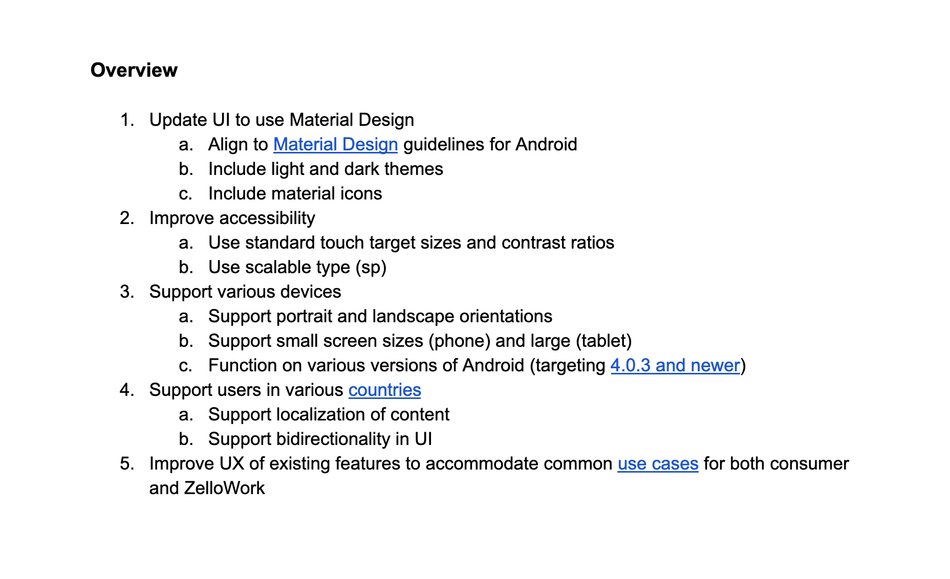
Scope and constraints
Since the task of updating the entire app was very large, I broke it apart into visual design updates and interaction design updates, mapping out requirements and timeline in a document. I chose to focus on updating the visual design first before diving into any interaction flows, since this would make a large impact and would give me a framework to build upon.
Previously, very little had been documented. It was clear that we needed to establish guidelines, but a full-fledged design system can mean a significant time investment. As the sole designer working with a single engineer on the project, our resources were limited, so I focused on scoping things to meet our specific needs.
A Sketch document shared via Google Gallery would effectively communicate design guidelines across the product and engineering teams—comprehensive enough to provide consistency to the product, but lightweight and flexible enough to extend in the future. I relied on native patterns when possible, communicating with engineering to understand feasibility and time estimates.
Taking inventory
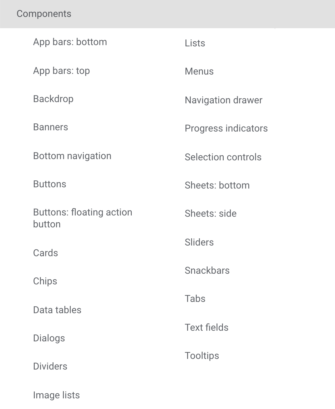
I began by taking inventory of the application and components. This involved going through each screen and flow, taking screenshots, and compiling an inventory of everything in the app—including patterns, colors, typography, icons, and spacing. Whenever possible, I mapped items to Material Design components (pictured on the right).
Throughout this process, I communicated with software engineers to understand how modular the code was and the reasoning behind different parts of the app.
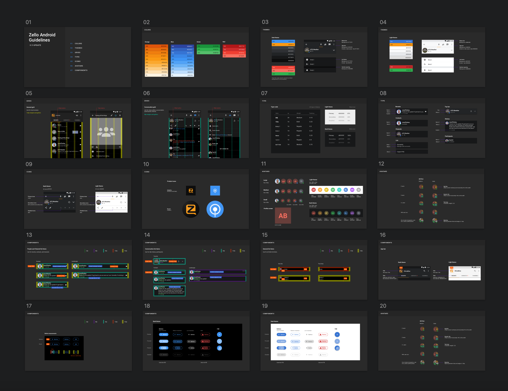
Artifacts
Below are a few selections from the design guidelines I created. This shared document allowed designers, product managers, and engineers to gain a better understanding of the product.
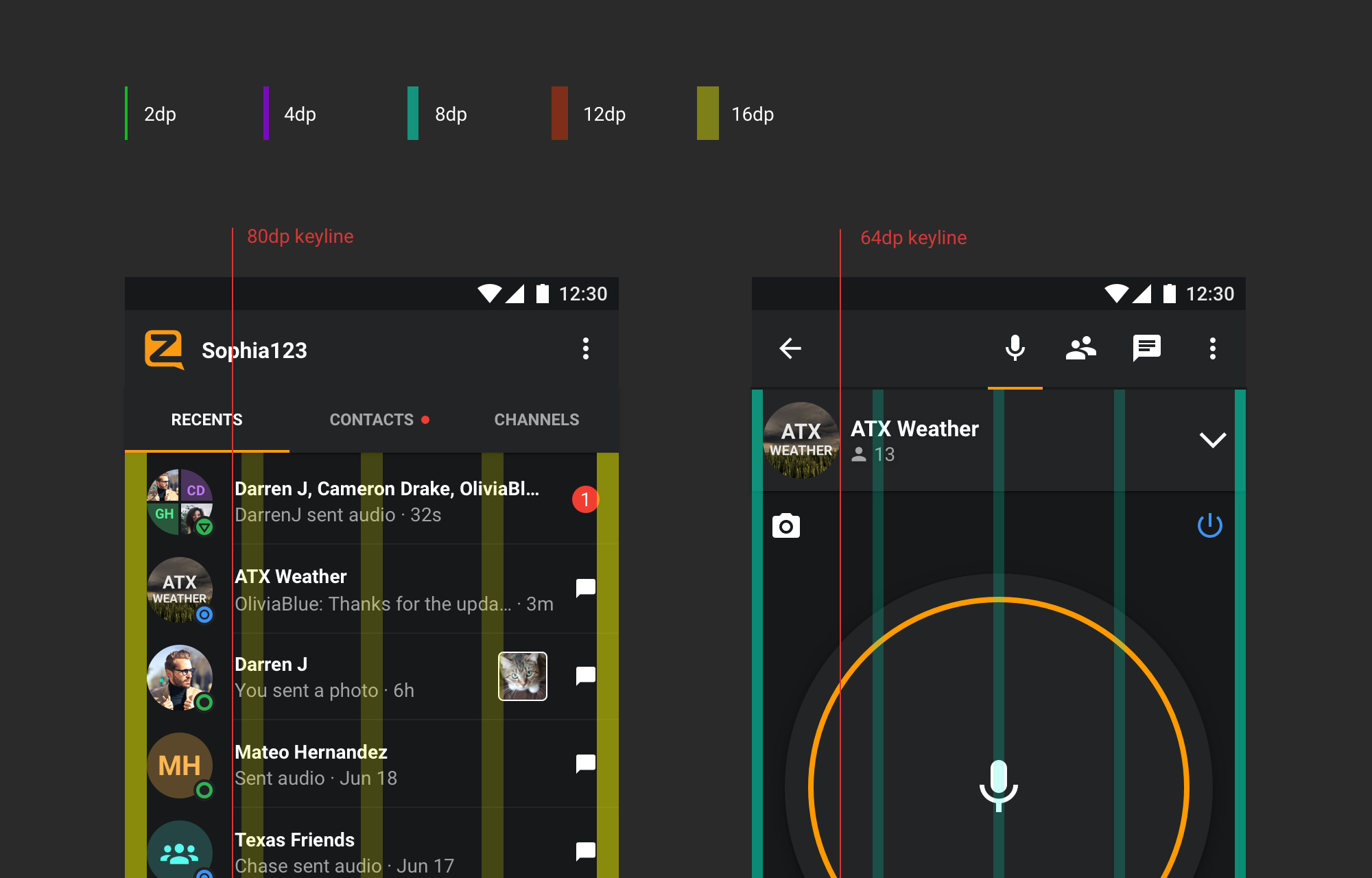
Spacing and type
I established a consistent spacing system for all screens, which also provides a framework to build any component from. I also developed a type ramp (not pictured), which served as a basis for repeatable text styles throughout the app.
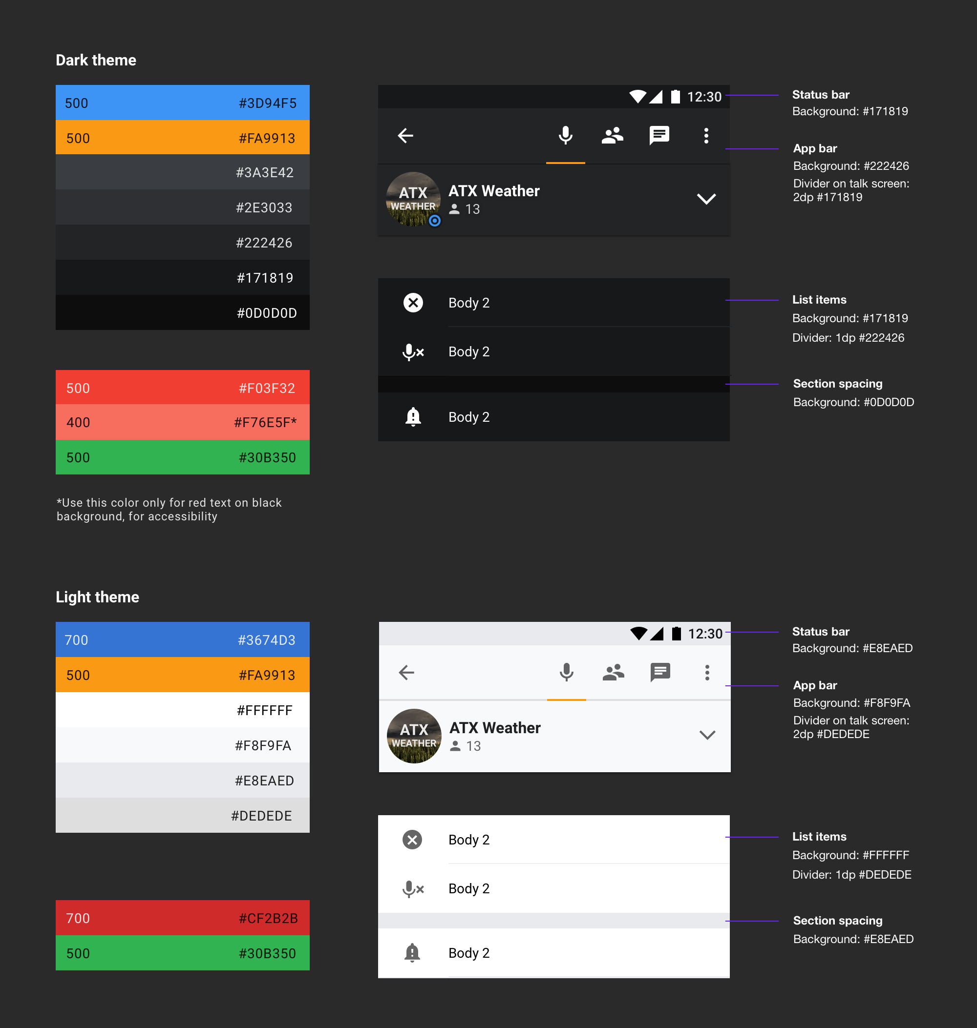
Color and themes
In order to make it easy to keep track of colors, I established color guidelines for both light and dark themes, keeping in mind contrast ratios for accessibility.
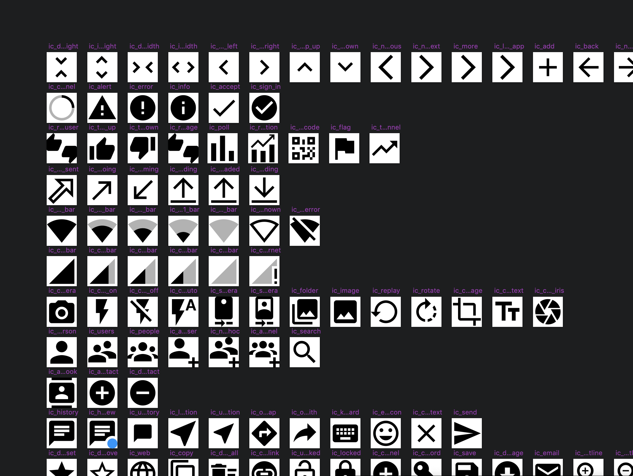
Icons and avatars
I created a shared icon library for SVG icons and defined styles for default avatars (not pictured).
Other components
I also included design guidelines for other components, basing many of these on Material Design guidelines. This section would grow and evolve with the product.
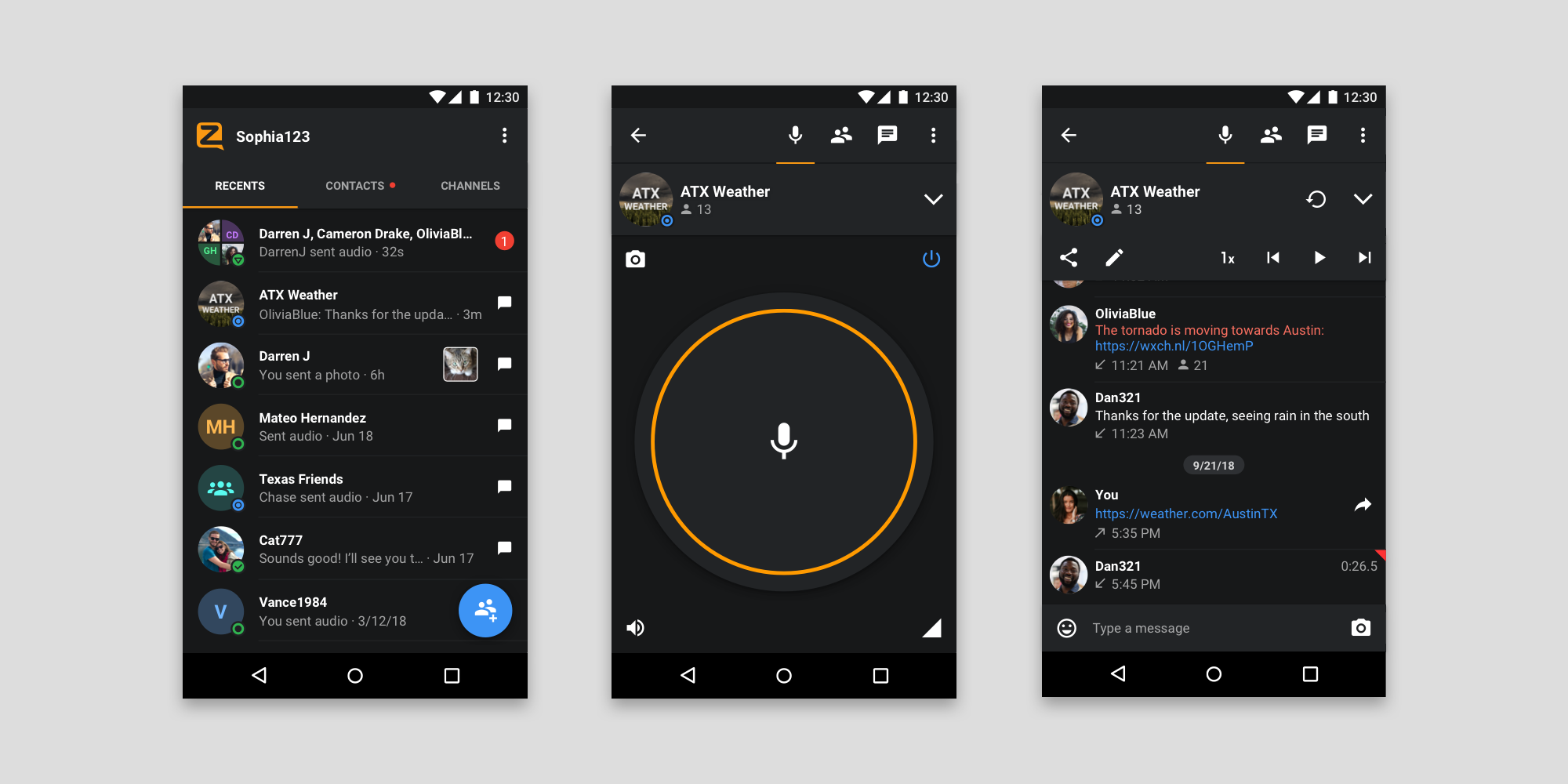
Final design
The project spanned several months, with myself and a single engineer working on it in addition to regular feature work. The result was an accessible new UI aligned with modern patterns. The updated design offers an improved experience for new users, who are familiar with Material Design patterns, without dramatically impacting the experience for existing users loyal to the powerful features of Zello.