Microsoft Teams
Improving video calls with user-facing diagnostics ∙ 2017

Improving video calls with user-facing diagnostics ∙ 2017
When a user experiences a problem during a voice or video call in Microsoft Teams, they need to be notified of it in an appropriate way and, when applicable, be given a way to fix it.
As an interaction designer on the Calling and Meetings team, I worked collaboratively with a PM on a framework for UFDs (user facing diagnostics) to classify notifications by their level of severity, taking into account different states of the app.
As part of my non-disclosure agreement, any confidential information has been removed from this case study. Any views reflected here are my own and do not represent the views of Microsoft.
It was 2017, and Microsoft Teams had just launched worldwide several months earlier. Much of my work during this time was spent bringing Skype for Business functionality to Teams, redesigning and improving features. This would eventually bring feature parity between the two applications, allowing companies to easily transition to Microsoft Teams.
As a designer focused on the meetings experience, one of my projects was designing the error messages a user sees in Teams: User-facing diagnostics, or UFDs.
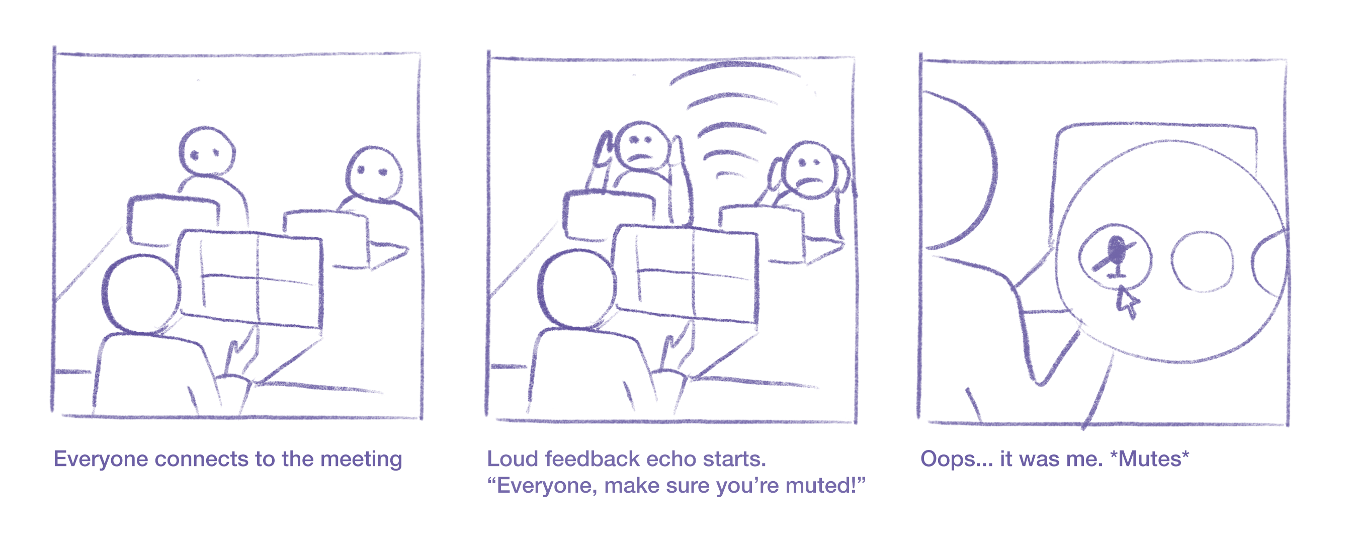
At the time, users often didn’t know why something in a meeting wasn’t working—why the meeting crashed, why the audio or video quality was bad, and how to fix an echo. This was reflected in feedback from the customers.
I was tasked with designing User Facing Diagnostics to improve these scenarios. These notifications would appear in the event of a problem, let the user know what happened, provide them any context on the issue, and, when appropriate, give them a way to fix it.
I worked on this project closely with a program manager, who put together a spreadsheet of potential UFDs gathered from an audit of Skype for Business and competitive research. It was a long list, and things needed to be prioritized in some way.
In order to better understand all of the cases I was designing for, I organized all of the information we had into a framework, mapping the UFD types across different states in the app. This would not only help us design the existing UFDs, but it would also provide a system to categorize any UFDs added in the future.
Mapping out the same information visually with wireframes made this framework easier to present to the design team for feedback, and ultimately, to the leadership team.
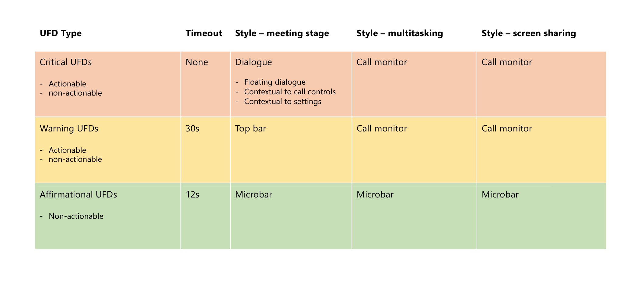
We began by roughly categorizing the UFDs into two groups. “Critical” UFDs, reserved for more severe issues that leave a user unable to progress in a meeting, require an interruption of experience. “Warning” UFDs would be used for less severe issues and therefore should be less disruptive.
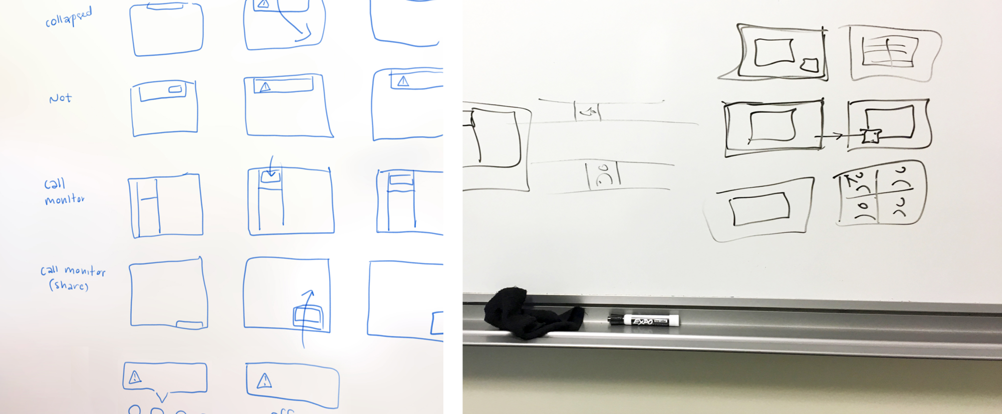
We went to the whiteboard to visualize our ideas, discussing the best ways to present the two types of messages to the user. We came up with some initial solutions, but because of the many different states a user could be in when an error occurs, it was clear that things had to be defined further. Timeouts, actions, and placement needed to be clarified.
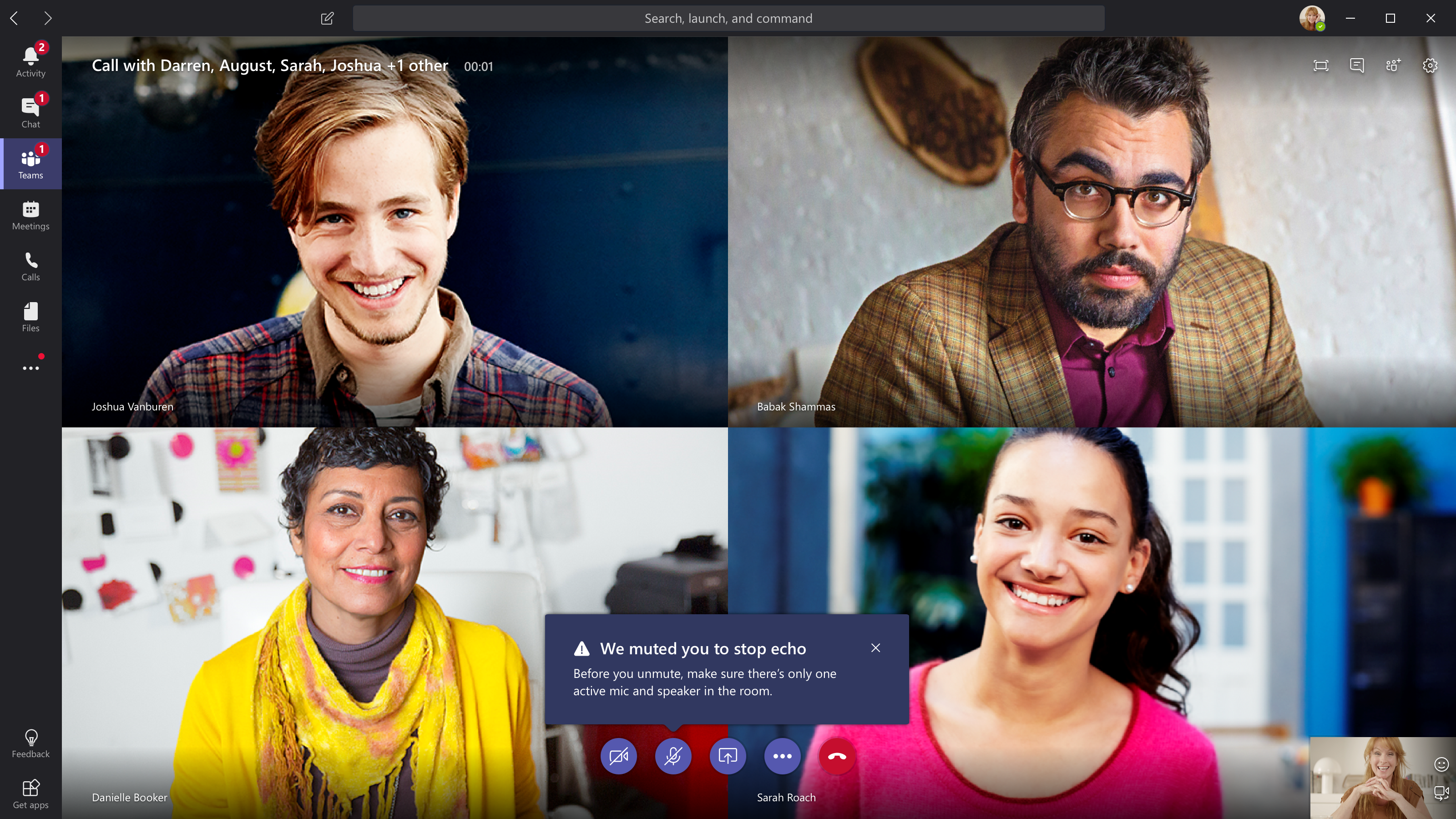
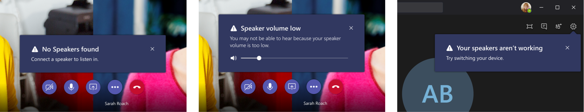
Critical UFDs are shown in the most severe cases and require immediate attention, disrupting a user’s experience by appearing over their screen. An example would be the aforementioned “feedback echo” issue, when a very loud echo is being generated by multiple microphones in a room.
I designed a default floating dialog as well as contextual versions for specific issues. This not only informs the user of a problem, but it also helps them to learn where in the UI to go to make adjustments. In addition to this, I considered user on and off states—critical UFDs would remain until dismissed, even after UI controls time out.
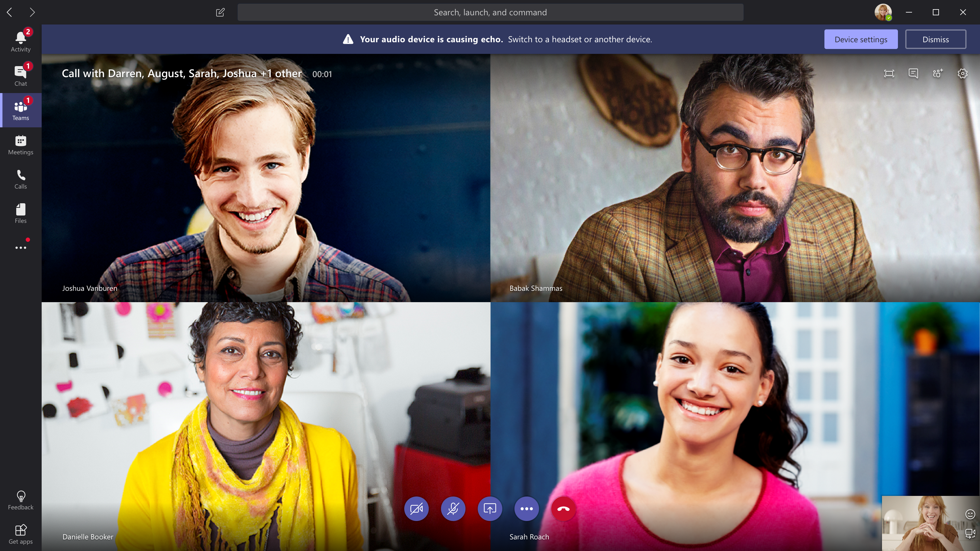
Warning UFDs are reserved for less severe situations and are therefore less disruptive, appearing out of the user’s way in a top bar and timing out after 30 seconds. I designed actionable and non-actionable versions, including a call to action to fix the issue when applicable.
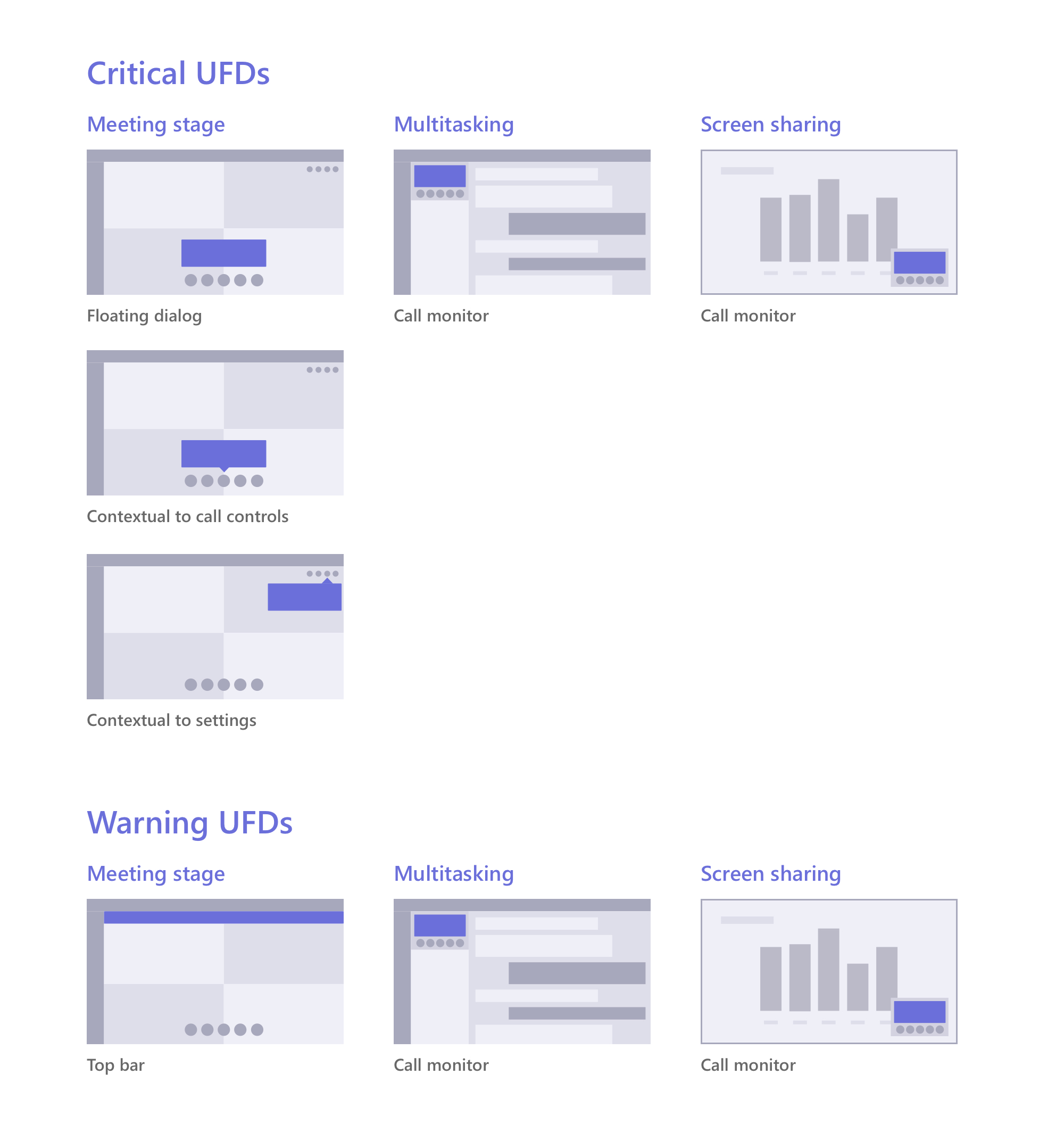
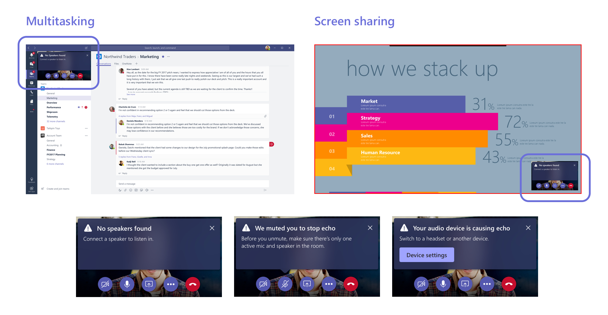
I also accounted for multitasking and screen sharing scenarios, making sure both critical and warning UFDs worked across all states that the user might be in during a meeting. This was a challenge, as all messages had to scale to fit within a small space.
Once the styles were finalized, I worked with a UX writer to tweak the messages to make sure everything was easily understandable, aligned with our product voice, and fit with enough room to be localized into 50+ languages. I also worked with a visual designer to align to our design guidelines and incorporate the UFD styles as a new pattern.
In the next year, feature parity with Skype for Business was reached, allowing more companies to transition to Teams. While the UFDs I worked on were a small part of this work, they improved the meetings experience by giving users more transparency around a problem and control in fixing it.